Content Management
This manual is intended to describe in detail the methods of content creation, management and presentation. It also describe the individual functionalities, which bind to all or a certain type of content. It includes a presentation of the ways to search and review content.System login
To edit the content, the user must first login in the platform. For platform login user must press the button  . The login fields are displayed. Login can be done in two ways.
The first way is through the Facebook, Google+ or Twitter platform. For login via Google + user account, user should press the button Sign in with Google+. Google+ account entry will appears. The user must enter a username and password of Google+ account. The same applies to Facebook and Twitter.
The second method is classic. The user should in the E-mail field enter your username or e-mail address and in the Password field his password. Login is performed by pressing the button Sign in.
Edit user account
After a successful entry into the platform, the user can edit some settings in his user account. User can access edit interface by clicking on his name or image in the upper right corner of the platform. Displayed interface contains the following fields.
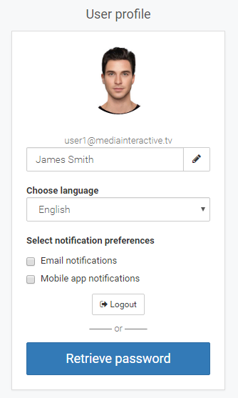
Image – edit user account interface
-
Picture of user. The user can replace your display picture. This is done so that the cursor is placed on the image that the button to change the image appears.
-
Field for setting first and last name. User can change his first or last name in a way that enter new name in the field and press button with a pencil.
-
Language selector. The user can switch between the list of interface languages.
-
Check box to activate email notifications. The user will receive notifications on his email address.
-
Check box to activate mobile app notifications. The user will receive notifications through the miBox application.
-
Logout button.
-
Retrieve password. The user can set a new password.
Create asset
The user can create asset or add a file in five ways.
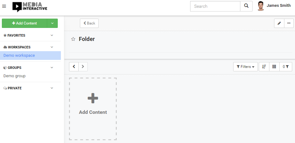
Image – user interface for asset creation
In each of the ways to add asset, the asset is added to a folder (within the workspace or group) that is currently selected (in the picture above, under a folder named Folder). In the event that the selected asset is not a folder, the content is added to the folder in which the currently displayed asset is located. The criteria for adding the content into the structure is always the currently displayed asset.
Ways to add content:
-
By pressing the button
 (top left in the picture above). In this mode, the user can select multiple files of different types (video, audio, image, etc.). For each selected file the asset with title is created, as well some fields are filed and in some content types of files some additional actions is taken (more in the chapter Automatic detection of file type). User can also upload files by bulling them over that button.
 -
By pressing the plate Add Content (bottom left in the image above), which is located next to the existing assets. This mode is identical to pressing the green button Add Content. Users can also drag the desired files to the plate and the file will automatically uploaded.
-
By selecting option
 Add file(s), to which the user can access by pressing the green button, which is located next to the button Add Content (see image above). This mode is identical to the first two.
 -
By selecting option
 Add Assert, to which the user can access by pressing the green button, which is located next to the button Add Content (see image above). In this mode, new empty asset is created, which means that most of the fields are empty. After pressing the button, the edit asset interface will appear (more in chapter Edit asset).
 -
By selecting option
 Add Folder, to which the user can access by pressing the green button, which is located next to the button Add Content (see image above). In this mode, new empty asset is created, which has set the folder functionality. A folder is created. After pressing the button, the edit asset interface will appear (more in chapter Edit asset).
All five ways to add asset are enabled or appear if the user has the right to add asset/file to a particular workspace or group.
Edit asset
The user can access the edit asset interface in three ways.
-
If the user has displayed asset (part of the user interface to display content), which wants to edit, he can access the edit asset interface by clicking on the edit button
 or press the button three dots
  and then choose the option Edit asset (the button at the top right in the image below). Both buttons are available to the user only if he has the right to edit the displayed asset (right Asset/Update or he is the owner of the asset).
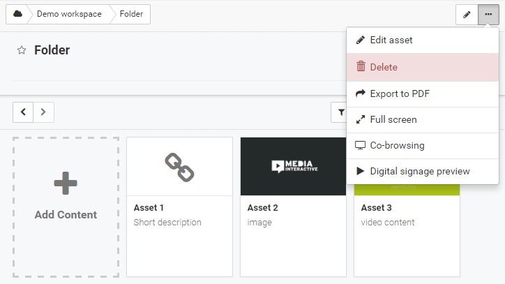
Image – the button for edit asset
-
In the part of the user interface for the list of assets, the user can press on the button three dots
 (the button is hidden and is displayed when the mouse is moved over the asset) and then choose option Edit asset (image below). The button is available if the user has the right to edit this asset.
Image – the button for edit asset
After pressing the button, the edit asset interface for editing selected asset will appear (image below). Similarly as in the creation of new asset.
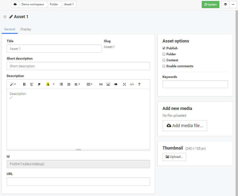
Image – the edit asset interface
In the upper right corner, the asset title is displayed. In the center are the various tabs. The tabs are visible depending on user rights. The usual user with right to edit can see the General and Display tab, in some cases also Cuepoints tab. Below them are the fields to edit the title, a short description, a description and other fields (more in chapter Explanation of individual fields on the asset). On the right side of the interface, several modules are displayed. Module with basic options, module for adding media file, module to change the thumbnails and other modules that are displayed depending on the type of uploaded files (more in subchapter Explanation of different tabs with fields).
The user can at any time save the corrected fields. This is done by pressing the green button
 and wait until the word Updated! (image below).
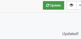
The user can switch in to display mode by pressing the button
 . Fields that have been corrected since the last save will not be saved!
 -
The third option is to edit asset via tools for multiple editing, which is described in the next section (in chapter Edit selected assets) and is similar to the classical editing.
Edit selected assets
The platform also allows user to edit multiple asset simultaneously. The user is able to perform selection if he has opened Side List or Table view on list of assets. In this two views user can perform assets selections and then on them perform operations. If user select one or more asset in the top right corner of the list of assets view, a new button with three dots  will appear. If the user wants to edit the selected assets, he must shoos option
  Edit assets (image below).
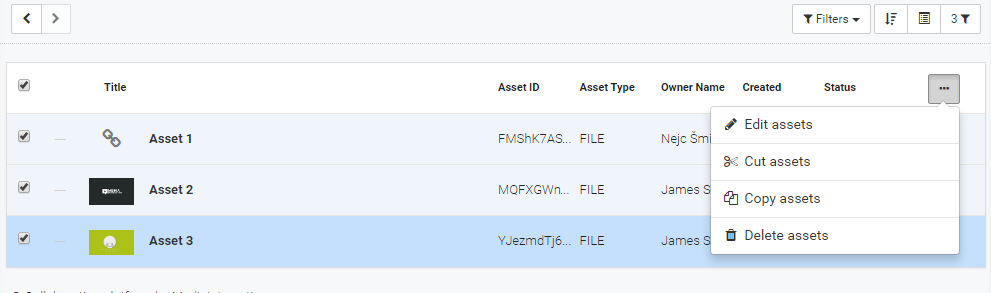
Image – asset selection in table view
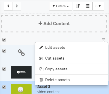
Image – asset selection in side list view
After pressing the button, the multiple edit assets interface for selected assets will appear.
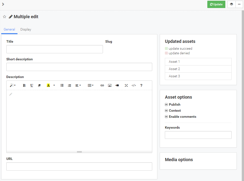
Image – the multiple edit assets interface
In the middle of the interface are located two or more tabs (depending on the rights of the user) in which there are several fields. On the right side of the multiple edit assets interface the list of edit assets is displayed. In the multiple editing mode, the user has less available fields for editing, as usual.
The user can at any time save the corrected fields. This is done by pressing the green button and wait until the word Updated!. In the list of edit assets specific asset is turned in green if it has been updated successfully or in red if there was an update rejection or an error occurred.
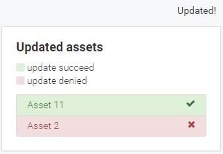
Image – multiple assets update
Explanation of individual fields on the asset
Chapter is devoted to the interpretation of individual fields on the edit asset interface. Certain fields and tabs are visible only to users with specific rights, which are outlined in each field separately.
-
Explanation of different tabs with fields
-
The General tab covers general fields
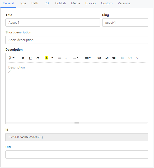
Image – the edit asset interface, the General tab
-
Title: asset tile
-
Slug: descriptive name by which user can directly access the asset. For example, if user in browser enter URL domain/slug, specific asset will appear.
-
Short description: a short description of the asset that is visible under the asset content.
-
Description: an extensive description of the asset. Box contains a row for the description styling, add images, tables, links and also look for code editing. Explanation of the individual buttons:
 - button to edit text formats
 - button to bold text
 - button to underlined text
 - button to remove font style
 - button to select the foreground and background text color
 - button to add unordered list
 - button to add ordered list
  - button to change paragraph
 - button to add table
 - button to add link
 - button to insert image
 - button to add connection to video
 - button to display the editor in full screen mode
 - button to enter in code view
 - button that displays information about shortcuts
 -
Id: unique asset identifier.
-
URL: filed shows the path to the content. The field is in the case file uploading automatically added (more in chapter Automatic detection of file type). The field is used in assets type image, URL and AUDIO. Field shows pat to file (audio, image or any other format) to be displayed on the asset. The field is visible only in the case that the content type is set to URL.
-
-
Tab Type includes fields relating to the type of content. The entire tab is visible only to the administrator.
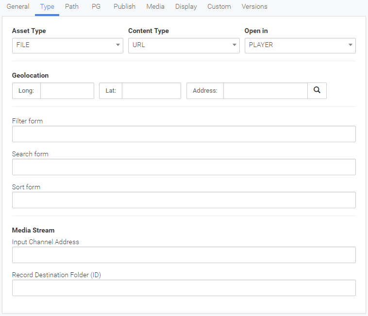
Image – Type tab
-
Asset Type: drop-down menu to select the type of asset, so what function will have asset. There are the following types of asset:
-
FILE: asset represents the file (the most common asset type).
-
WORKSPACE: asset represents the workspace - a home asset of the workspace.
-
GROUP: asset represents the group - a home asset of the group.
-
STREAM: asset represents streaming video - live video.
-
SEGMENTED_STREAM: asset represents streaming video from live event. Segmentation allows the user to move reverses on timeline and if necessary return to live video.
-
FILTER: asset represents a saved filter. Content represents a saved filter. Click on asset trigger saved filter.
-
DIRECT: asset represents private conversation - a home asset, which represents the private conversation between two users.
-
-
Content Type: drop-down menu to select the format of the content on the asset. All types are explained in detail in chapter Asset type. We distinguish several types:
-
VIDEO: type intended for video content. On the asset is displayed player to play uploaded video file.
-
AUDIO: type intended for audio content. On the asset appears player for playing uploaded audio file.
-
IMAGE: type intended for image content. On the asset above description, uploaded picture is displayed.
-
URL: type intended for HTML content that can be uploaded to the platform or via the link connected with the platform. On the asset is displayed HTML. HTML content can only be upload via ZIP format, in which all the relevant file (eg index.html) is located. In the event that HTML content is presented via a link, the appropriate link must be entered in URL field (described below).
-
DOWNLOAD: type intended for files distribution between users. On the asset a bug button for download will be displayed.
-
VIDEOCOURSE: type intended for video course. On the asset is displayed player to play uploaded video file, as well as questions that are placed on the video timeline.
-
PLAYLIST: type designed to create a playlist. On the asset the interface for creating playlist is appeared.
-
MAILING: under construction
-
Smart Widgets: under dividing line the names of all widgets on the platform will be listed.
-
-
Open in: drop-down menu to select how will content opened. There are three options:
-
PLAYER: the asset is displayed within the platform in current window.
-
WINDOW: the asset is displayed within the platform in new window/tab.
-
OVERLAY: the asset is displayed in an overlay.
-
-
Public Workspace: check box represents a setting that defined the workspace as public. The field is visible only in the case that the Asset Type is set to WORKSPACE (field is visible only to the administrator).
-
Filter form: field allow entering a filter form on the asset. The filter effect on the list of assets under the asset and is triggered when the asset is clicked.
-
Search form: field allow entering a search form on the asset. The text search effect on assets list under the asset and is triggered when the asset is clicked.
-
Sort form: field allow entering a sort form on the asset. The sort effect on order the list of assets under the asset and is triggered when the asset is clicked.
-
Input Channel Address: field to enter a address (rtsp) to a video or audio source (media stream). The field is suitable for the Asset Type STREAM or SEGMENTED STREAM.
-
Record Destination Folder (ID): filed refers to live stream record. By default, recordings assets are created under asset that displays live video. In the following field user can enter the asset ID, under which recordings assets will to be created.
-
Start record time: field represents the start time of recording. The field is visible if data start_record_time is on asset.
-
Stop record time: field represents the time when the recording was stopped. The field is visible if data stop_record_time is on asset.
-
-
Tab Path includes fields relating to the asset location (within the platform) and time when the asset was created. The entire tab is visible only to the administrator.
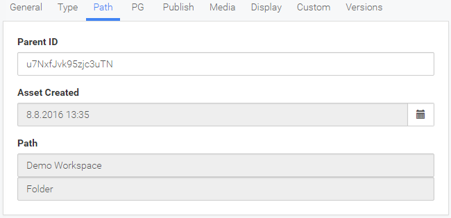
Image – Path tab
-
Parent ID: field represents the ID of the parent asset or folder. By changing the ID asset can be moved on new location.
-
Asset Created: field represents the date and time when the asset was created. The field can not be changed.
-
Path: field shows the position of asset (refers to Parent ID). Example: The figure above shows the position of the asset, which is located inside the folder named Folder that is located inside the folder named Demo Workspace.
-
-
Tab PG includes fields that relate to the asset rights management. The entire tab is visible only to the administrator.
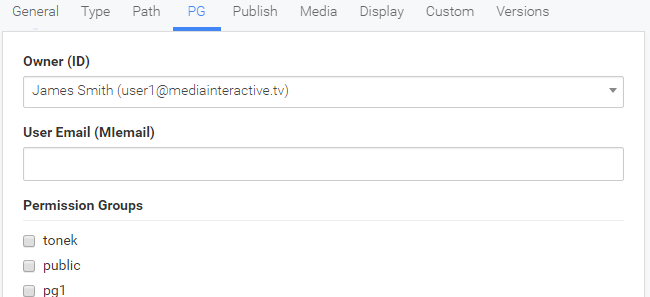
Image – PG tab
-
Owner (ID): drop-down menu shows the user (name and email address), which is owner of the asset. Owner can be changed by selecting the desired user in the menu. The owner has the right to edit the asset.
-
User Email (MIemail): field represents the email address of the user. This field is useful in the case that the asset represents a particular user.
-
Permission Groups: a list of all permission groups, in which asset can be added. The check mark before the name of the group allow administrator to add asset within group. Only system administrator can manage asset permission group.
-
-
Tab Publish includes fields relating to the visibility of the asset. The entire tab is visible only to the administrator.
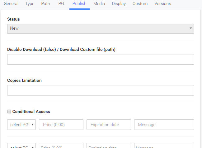
Image – Publish tab
-
Status: field represents the status of the asset. The field cannot be changed and is set automatically. Status is primarily intended course of uploading content (more in chapter Automatic detection of file type). Several statuses is possible:
-
New – asset has just been created
-
Ready – uploaded file is ready for display
-
Pending – awaiting the beginning of a process over uploaded file
-
Queued – media file is waiting for transcoding
-
Uploaded – the file has been successfully transferred to the platform
-
Uploading – the file is uploading to the platform
-
Processing –certain processes over content is performing
-
Transcoding – transcoding media files on the asset
-
Error – an error has occurred in the processing of uploaded files (audio conversion, opening the zip file)
-
-
Disable Download (false) / Download Custom file (path): field is intended for blocking the download button or to change the path to the file that will be downloaded. If the user wants to disable the Download button, he must enter false value. If the user wants to define another path to the file to download, he must enter the path to the desired file.
-
Copies Limitation: field constitutes a restriction on the number of simultaneous access to the asset. How many users can simultaneously watch and is located on the asset.
-
Conditional Access: list allows you to configure access control to the specific asset or to set up a payment to access to the asset. It can be set to 5 different rules for different permission groups. The rules are in use, if the check box is set checkmark. Learn more about this functionality in chapter A detailed description of the functionality - Conditional Access).
-
-
Tab Media includes fields relating to the media content. The entire tab is visible only to the administrator.
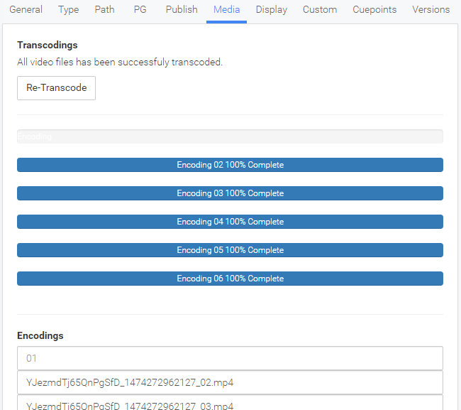
Image – Media tab
-
Re-transcode: button trigger re-transcoding the media file that has been uploaded to the asset. This button is only available in the case that media file was uploaded on the asset.
-
Transcodings: graphical interface that shows the progress of transcoding.
-
Encodings: six fields for six different qualities of encoding (the first is the best). User can change specific field. If the field is empty, this encoding is not available. Default naming is as follows: ID (unique asset identifier + time stamp) + _01 (encoding quality).
-
-
Tab Display includes fields relating to the asset display.
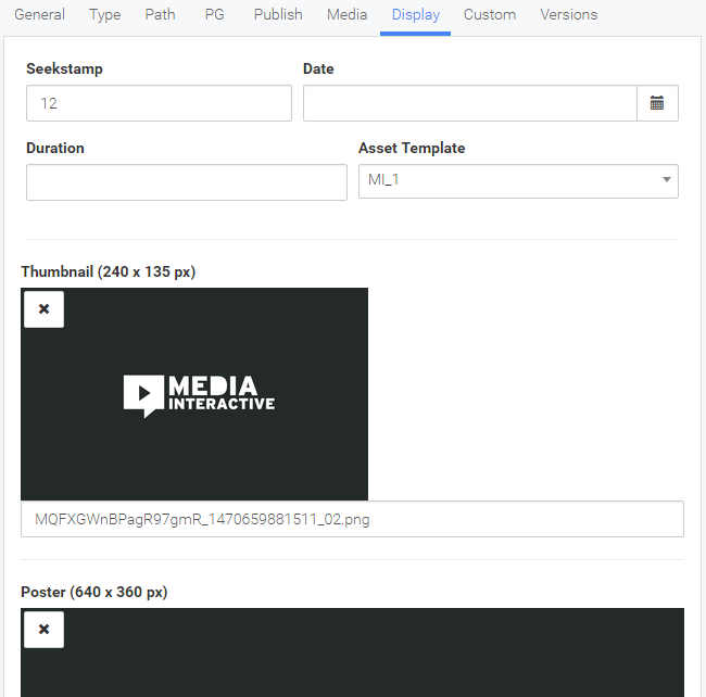
Image – Display tab
-
Seekstamp: field represents seekstamp order (recommended the use of numbers).
-
Date: field represents the adjusted date with time, by which users can order assets. The field represents the date, which is by other users considered as a date that represents the asset creation. If a field is defined, under asset content text that explain how long ago asset was created is displayed.
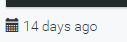
Image – creation time display
-
Duration: field represents the duration of the media. The duration is visible on the asset, which is located in the list of assets and on the asset content. Duration is automatically set when you upload media file.
-
Asset Template: drop-down menu to select asset look inside the list of assets.
-
Thumbnail: field represents an image that represents the asset in the list of assets - recommended dimension is 240x135 px. The field consists of several elements. The first element is image display. The second element is
 Upload… button, which is intended to upload image and is visible if the image has not yet been uploaded. The third element is remove image button
  , which is visible on the image. The fourth element represents the name of the image. In this field user can enter the name of any image that is located in the directory for images. The image is automatically generated when various types of files are uploaded. The field is also used when asset represent WORKSPACE (more in chapter Asset type).
 -
Poster: field represents the poster that appears in the player to the beginning or at the end of the video or audio content - recommended dimension is 640x360 px. The field consists of several elements as in the thumbnail field. The image is also automatically generated when various types of files are uploaded.
-
-
Tab Custom is show the filed that is custom added on platform. The entire tab is visible only to the administrator.
-
Tab Cuepoints is used for managing cuepoints on media content (video or audio). The tab is visible only in the case that the content type is VIDEO, AUDIO or VIDEOCOURSE.

Image – Cuepoints tab
The user can create cuepoint in the interface for a quick overview of media file (explains chapter Module for review and editing of media file). Cuepoints edit interface consists of several parts (see the picture above).
The first part is devoted to displaying thumbnails. It consists a part for image display, button to replace image and button to remove image. Thumbnails are automatically generated from the video. The second part is devoted to displaying poster. It also consists a part for image display, button to replace image and button to remove image. Poster is also automatically generated from the video. The third part represents a cuepoint description. It contains title field, description field in which can be enter text which will be visible under the cuepoint and time field that represents the video time in which the cuepoint will be displayed. The fourth part represents two buttons. The button to update cuepoint information and the button to delete cuepoint.
More about the process of adding cuepoints will be explain in chapter Adding cuepoint to media asset.
-
Under tab Versions, previous versions of asset can be reconstructed (more in chapter Versioning). The tab is visible only to the administrator.
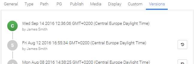
Image – Versions tab
-
-
Asset options module interpretation
The module is located in the upper right corner of the edit asset interface. It contains some of the key settings that affect the appearance of the asset or represent the asset role.
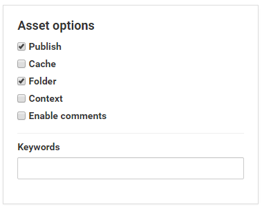
Image – Asset options module
-
Publish: check box represents a setting that determines whether the asset is visible to users or not. If check box is not selected no user (except the owner or administrator) can see the asset, even if users have a right to it.
-
Cache: potrditveno polje predstavlja nastavitev, ki določa, da je vsebina vedno dostopna na uporabniški napravi oziroma brskalniku.
-
Folder: check box represents the setting if asset represents a folder. If check box is selected, asset can contain other assets. The field is visible to the user, which has update and add right.
-
Context: checkbox allows you to enable contextual lines. This line is visible just below the asset (more in chapter Contextual row).
-
Enable comments: check box to display the comments tab in the contextual line.
-
Keywords: the field in which user can specify more than one keyword. Keywords will be visible at or below the asset. Keywords helps users to find the desired asset or content.
-
-
Module Add new media/file
The module is located on the right side of the edit asset interface. The module contains the button
 Add media file... or Replace media file... through which the user can upload file. While file is uploading, upload progress bar is displayed. Above the button displays the name of the uploaded file. After file upload is complete, automatic detection of file type is carried out. The result of the automatic field detection are some workflows which are dependent on the file type (more in chapter Automatic detection of file type). If the file type is video, transcoding is performed – displays the status of transcoding and button for eventual re-transcode (the button is displayed if the user has the right Other/Transcode).
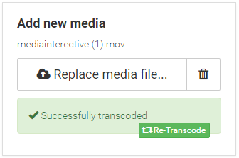
Image – module Add new media
-
Module to upload or change thumbnail
The module is designed to upload, view or change asset thumbnail or image which represents asset in the list of assets. Module displays a thumbnail and contains two buttons. Button to add or replace the image and the button to remove the image.
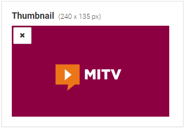
Image – module to upload or change thumbnail
-
Module for review and editing of media file
The module is designed to review, trimming media file and creating cuepoints, poster or adding watermark to the video. The module is only available in the case that the user upload a video or audio file. The central part of the module represents the player for quick preview. Underneath is a button bar for trimming video (visible only to the user that has the right Other/Transcode). Restore from original button (top right) also refers to trim functionality and allows the user to recover the media files in their original state (visible only to the user that has the right Other/Transcode). Learn more about the procedure of trimming in subchapter Trim video file.
Underneath the trim buttons, there are two buttons. Make Cuepoint button to generate cuepoint. When user press the button, screen capture form quick preview player is taken and then capture is used for cuepoint creation (more in subchapter Adding cuepoint to media asset). The second Set Poster button is intended to create poster. When user press the button, also screen capture form quick preview player is taken and then capture is used for poster creation.
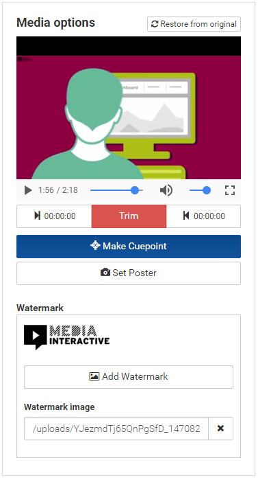
Image – module Media options
This module is also designed for adding watermark to video (visible in the event that the user has the right Other/Transcode). The interface contains a field to upload watermark image, and the Add Watermark button to perform video watermark (more in subchapter Add watermark on video).
Automatic detection of file type
The platform enables the automatic detection of the uploaded files. The result of the automatic field detection are some workflows, which are dependent on the file type.
-
Video file
In case that the user through module to upload files upload the video file, the following operations are carried out:
-
Field Asset Type is set to FILE.
-
Field Content Type is set to VIDEO.
-
Field Open in is set to PLAYER.
-
Module for review and editing of media file is shown and quick video preview which is lower quality is created.
-
A thumbnail is created – from video capture at 30 seconds.
-
A poster is created – from video capture at 30 seconds.
-
Video file is automatically transcode. Which coding and quality will be created depends on the general settings on the platform.
-
In the field encoding is entered encode names that have been added to the queue for transcoding (depending on the general settings on the platform).
-
In the Duration field is set the duration of the video file.
-
Download button is visible.
-
-
Audio file
In case that the user through module to upload files upload the audio file, the following operations are carried out:
-
Field Asset Type is set to FILE.
-
Field Content Type is set to AUDIO.
-
Field Open in is set to PLAYER.
-
Module for review and editing of media file is shown and quick video preview which is lower quality is created.
-
A thumbnail is created – if the audio file contains an image.
-
A poster is created – if the audio file contains an image.
-
The audio file is automatically converted in the appropriate format (it may take quite some time) - the alert Upload completed, please wait to finish is displayed.
-
In the field encoding under 6 quality encoding is entered the name of the transcoded audio file.
-
In the Duration field is set the duration of the audio file.
-
Download button is visible.
-
-
Image
In case that the user through module to upload files upload the image file (png, jpeg or gif), the following operations are carried out:
-
Field Asset Type is set to FILE.
-
Field Content Type is set to IMAGE.
-
Field Open in is set to PLAYER.
-
A thumbnail is created.
-
A poster is created.
-
In the URL field is set the path to the image file.
-
Download button is visible.
-
-
PDF
In case that the user through module to upload files upload the PDF file, the following operations are carried out:
-
Field Asset Type is set to FILE.
-
Field Content Type is set to URL.
-
Field Open in is set to PLAYER.
-
A thumbnail is created – the first page of a PDF document.
-
A poster is created – the first page of a PDF document.
-
In the URL field is set the path to the PDF file (/pdf/viewer.html?file=path to PDF).
-
Download button is visible.
-
-
Slides
In case that the user through module to upload files upload the ppt or pptx file, the following operations are carried out:
-
The file is converted to PDF format.
-
The asset to display PDF file is created (see previous section PDF).
-
Each slide is converted in the image asset, which is located under PDF asset (see previous section Image).
-
-
ZIP
In case that the user through module to upload files upload the ZIP file, the following operations are carried out:
-
Field Asset Type is set to FILE.
-
Field Content Type is set to URL.
-
Field Open in is set to PLAYER.
-
A thumbnail
 (fa-archive) is created.
 -
In the URL field is set the path to archive file (/content/ + ID + /index.html). Archive is expanded into a folder named after asset ID. By default, the path to the file index.html is set.
-
Download button is visible.
-
-
Other types of files
In case that the user through module to upload files upload the file which is not video, audio, image, PDF, or ZIP, the following operations are carried out:
-
Field Asset Type is set to FILE.
-
Field Content Type is set to DOWNLOAD.
-
Field Open in is set to PLAYER.
-
A thumbnail
 (fa-download) is created.
 -
Download button is visible.
-
A detailed description of the functionality
This section will be described in more detail instructions for specific functionality.
-
Conditional Access
Conditional access functionality allows the administrator to disable the display of asset content before the user does not pay a certain amount. The administrator can also determine how long the content will be visible to the user who has paid the amount.
This functionality can be activated in the edit assets interface under tab Publish, the field Conditional Access. The rule for conditional access consists of four fields (see image below).
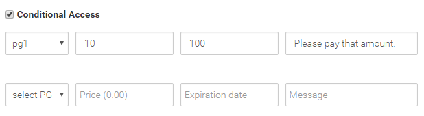
Image – interface for conditional access
-
Dropdown menu for setting permission group to which a particular rule works. For users who are in selected permission group called PG 1, the rule will be enabled.
-
Field for setting the price. Field specifies the amount of EUR (20 equals 20 eur), which the user must pay to be able to access the content.
-
Field for adjusting the duration of access. Field determines the number days. If the value is set to 100, it means that the user who carried out the payment, content will be accessible 100 days.
-
Description field. Field represents text that is visible to the user before the payment is made (figure below).
There are 5 fields for different rules. The rules are enabled only if the Conditional Access check box is selected!

Image – conditional access warning
The content on the above image is visible to the user who wants to access the asset with enabled conditional access. The user can make the payment via the payment method PayPal.
-
-
Adding cuepoint to media asset
Functionality of adding cuepoints on video asset allows the user that add an image with text, which will displayed at a specific time of video. Cuepoints emphasize certain parts of the video and enrich it with a description or picture. Cuepoints can also be used to display slides. Cuepoints make video asset more transparent and interesting.
The cuepoints may be used only on the video assets, which means that before user can create cuepoints the video file should be uploaded on asset. After uploading is completed, the module for review and editing media file will paper. This module has the button Make Cuepoint (see image below).
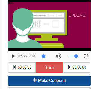
Image – the button to add cuepoint
The process of adding it easy. The user simply moves to a specific minute of video, and press the button make Cuepoint. When the button is pressed, on the left side of the edit asset interface, a new tab Cuepoints will appear (see image below).
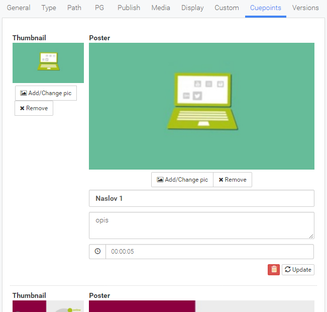
Image – edit cuepoints interface
In the upper left corner is located part witch is devoted to setting thumbnail. It consists a part for image display, button to replace image and button to remove image. In this case, the thumbnail represents cuepoint that is displayed under the video itself and represents the only indication (figure below). If you remove the thumbnail, image is not visible.
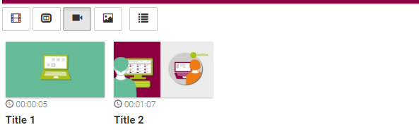
Image – cuepoint display under the video
In the upper right corner is located part witch is devoted to setting poster. It also consists a part for image display, button to replace image and button to remove image. In this case, the poster represents cuepoint image that appears when user click on cuepoint or when the video is played to a certain time which is defined on cuepoint (figure below).
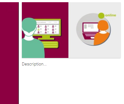
Image – cuepoint display beside video player, if cuepoint was selected
Under the part for displaying poster are also located three textual fields. The first is intended to title or brief description of the cuepoint. The title is visible on the thumbnail and is constantly visible under video. The second field is intended to more comprehensive description of the cuepoint and represents text that is displayed when cuepoint is selected. The text appears under the poster image, if it exists (picture above). The third and final field represents the video time in which the cuepoint will be displayed. The format for entering time is as follows: 0:00:19, where the first part represents the hour, second minutes, and third seconds. Time is visible underneath the thumbnail above tile of the cuepoint. At each change of these three textual fields, it is necessary to save the adjustment. Saving is performed by pressing the button Update.
The specific cuepoint can also be removed by pressing the delete button
 .
. -
Trim video file
Functionality of trimming allows user to trim uploaded video file. The functionality is available to users who have the right Other/Transcode.
User can perform trimming by using module for review and editing of media file inside the edit asset interface (image below). User should first set start time of trimmed video. To do so, user should first, in quick preview player, move video on desired start time and then klick on button
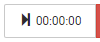 . Start time should be seen on the button. In the same way, user should also set the end time. User should also in quick preview player, move video on desired end time and then klick on button
  . End time should be seen on the button. Once the user is satisfied with the start and end time of trimming he should presses the red button
  . After button is pressed, new preview trimmed video will be created.
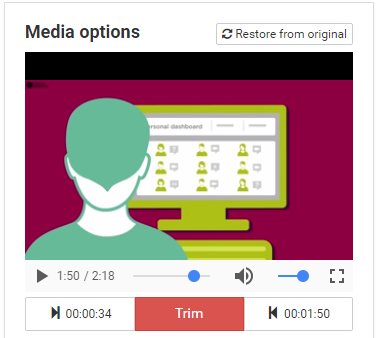
Image – module to review and edit media file
Final step is required for implementation of trimmed video. User should re-transcode trimmed video, by pressing the button
 (module to upload files). Trimmed video is translated into a number of different qualities, which are then visible to other users.
 In the event that the user wants to restore video to its original length, he must click on the button Restore form original, which is located in the upper right corner of the module to review and edit media file. After button is pressed, original preview video will be created. In order to finally restore to original video is also required to press the button Re-Transcode.
Trimming can be performed several times.
-
Transcoding
Transcoding is intended to convert video files (high quality) in several video files of various qualities (lower quality). These qualities are used in the video content in such a way that the player adjusts the video quality depending on the current bandwidth of the link (connection quality). The lower quality of the connection reflected in the lower quality of the video content.
The platform allows user to set six different qualities or video encoding. Which qualities will be created in transcoding process, is specified in the global settings of the platform.
Encoding
Resolution
Bitrate
Frames per second (fps)
01
1920x1080
3500
25
02
1280x720
1800
25
03
640x360
1200
25
04
400x224
600
25
05
400x224
300
25
06
400x224
110
25
Table – parameters of specific encodings
Under tab Media, within the edit asset interface, user can monitor the transcoding progress (see image below).
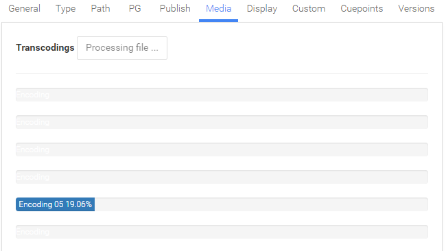
Image – tab Media with transcoding progress
During the transcoding, video content is not visible, but the information window is displayed (see image below).
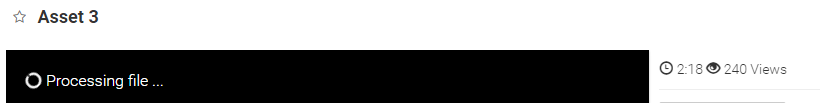
Image – information window on transcoding asset
Two fields illustrate the user that transcoding is still in progress. This is a field under the tab Media and field within the module to upload file (picture below). Asset status is set to state Transcoding.
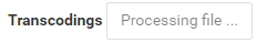
Image - information that transcoding is still in progress under the tab Media
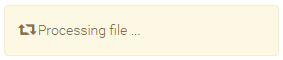
Image – information that transcoding is still in progress within the module to upload file
After transcoding is completed, user can re-transcode video file. This is done by pressing the button Re-Transcode under the tab Media or within the module to upload file.
The functionality is available to users who have the right Other/Transcode.
-
Add watermark on video
Functionality of adding watermark on video enables later enrichment video content with different logo or other visual materials. The functionality is available to users who have the right Other/Transcode.
The user (who has this right), after uploading video file, can also upgrade video with the watermark. User can add watermark by using module for review and editing of media file inside the edit asset interface (image below). First, the user should upload the watermark in the field Watermark image. After a successful upload Add Watermark button will appear. After button is pressed, new preview video with watermark will be created.
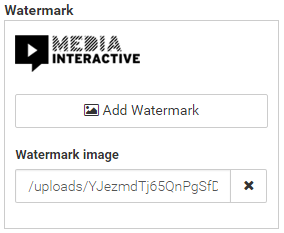
Image – module to add watermark
Final step is required for implementation of watermarked video. User should re-transcode watermarked video, by pressing the button
(module to upload files). Watermarked video is translated into a number of different qualities, which are then visible to other users.In the event that the user wants to restore video to its original state, he must click on the button Restore form original, which is located in the upper right corner of the module to review and edit media file. After button is pressed, original preview video will be created. In order to finally restore to original video is also required to press the button Re-Transcode.
-
PDF indexation
Functionality of indexing PDF files allows user to search by words that are in the text of a PDF file. Indexation is carried out automatically each time the PDF file is uploaded on the platform. The module within the edit asset interface (bottom right) shows the indexation state (image below).
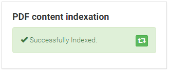
Image – module for re-index uploaded file
Inside the module it is a button for re-index file
 .
.
Delete asset
Any asset that is located on the platform can be deleted (if user has that right to delete). Deletion of asset can be done in three ways.
-
In the list of assets the user can on specific asset click on the button with three dots
and then choose option Delete (image below). The button is not visible if the user does not have Delete right.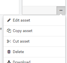
Image – button to delete asset
-
User can press the button with three
dots located in the upper right corner the section for preview asset content and then choose option Delete. The button is not visible if the user does not have Delete right.Image – button to delete asset
Each time the user click on a delete button the platform requires confirmation of deletion. Before deletion, the confirmation window will appear (see image below). If the user agrees with deletion the asset with the title written on confirmation window, he should click on the OK button, otherwise the Cancel button.
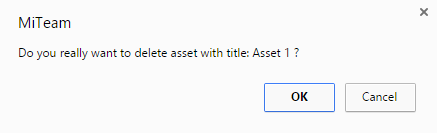
Image - confirmation window to delete asset
-
The third delete asset option is through delete selected assets workflow, which is described in the next section.
Delete selected assets
The platform also allows user to delete more assets at the same time. The user is able to perform selection if he has opened Side List or Table view on list of assets. In this two views user can perform assets selections and then on them perform operations. If user select one or more asset in the top right corner of the list of assets view, a new button with three dots
will appear. If the user wants to delete the selected assets, he should on the menu select  Delete assets option (picture below). Option is available to the user who have the right Assets/Delete.
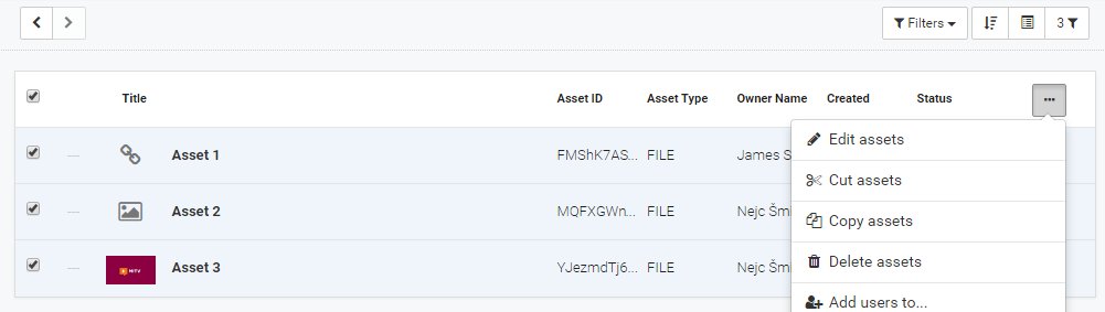
Image – asset selection for delete in Table View
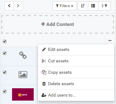
Image – asset selection for delete in Side List
Before deletion, the confirmation window will appear (see image below). If the user agrees with deletion of selection assets, he should click on the OK button, otherwise the Cancel button.
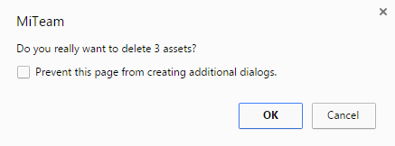
Image - confirmation window to delete assets
Delete assets from bin
When a user deletes the asset, the asset is transferred to the Bin, where waiting on final deletion. Final deletion also lead to the deletion of all files that have been uploaded to specific asset or were associated with it. Only system administrator can empty the Bin.
Placement of assets
The chapter refers to the procedures for moving the assets within the platform.
Create a folder
Any asset can be moved into a folder (if the user has the right to edit the content). This means that asset will be under other asset, which is folder. User can change asset into folder by selecting check box Folder in the edit asset interface and then save changes. On the list of assets, the folder asset will be displayed with the square plus (picture below).
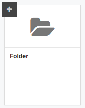
Image – folder in the grid view
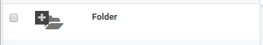
Image – folder in the side list view

Image – folder in the table view
Move the assets
Moving the assets from one folder to another, it is possible in three ways:
-
The first way is to change in the field Parent ID, which can be modified only by the administrator. Administrator can change Parent ID in the edit asset interface under tab Path. He should enter the unique asset/folder identifier (ID) under which he want to move editable asset. Asset is moved under desired folder.
Image – tab Path field Parent ID
-
The second way is through a method of Cut asset. User can cut asset by selecting
 Cut asset option (image below), which is located under the button with three dots (on the list of assets). The button is not visible if the user does not have the right Assets/Delete.
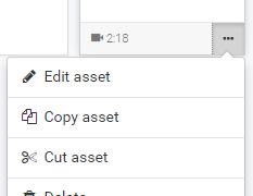
Image – option Cut asset
The user should then move to the desired folder and on the upper right corner click on the button with three dots
. Then he should select option  Paste assets (image below). Asset should then move under current folder. If the user wishes to cancel cut action, he should select option Clear clipboard.
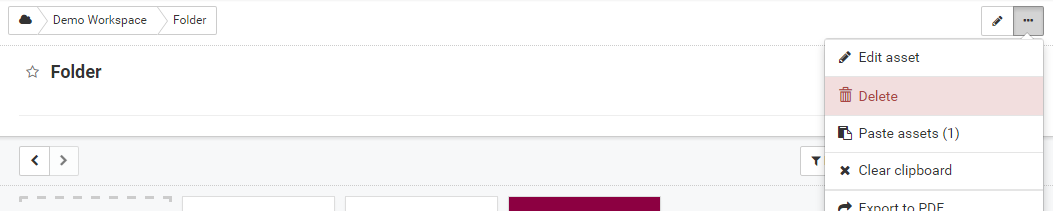
Image – paste asset under folder
-
The third way of moving the asset is via multiple cut action, which is described in the next chapter Movie selected assets.
Movie selected assets
The platform also allows user to move more assets at the same time. The user is able to perform selection if he has opened Side List or Table view on list of assets. In this two views user can perform assets selections and then on them perform operations. If user select one or more asset in the top right corner of the list of assets view, a new button with three dots will appear. If the user wants to cut the selected assets, he should on the menu select Cut assets option (picture below).
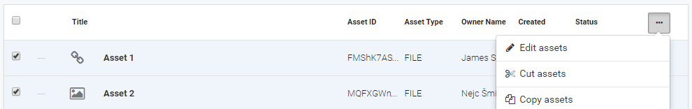
Image – asset selection for cut in Table View
Pasting assets may be performed on the way as described in the previous chapter.
Copy asset
Copying the assets from one folder to another, it is possible in two ways:
-
The firs way is through a method of Copy asset. User can copy asset by selecting
 copy asset option (image below), which is located under the button with three dots (on the list of assets).
Image – option Copy asset
The user should then move to the desired folder and on the upper right corner click on the button with three dots
. Then he should select option Paste assets (image below). Asset should then copy under current folder. If the user wishes to cancel copy action, he should select option Clear clipboard.Image – paste asset under folder
-
The second way of copying the asset is via multiple copy action, which is described in the next chapter Copy selected assets.
Copy selected assets
The platform also allows user to copy more assets at the same time. The user is able to perform selection if he has opened Side List or Table view on list of assets. In this two views user can perform assets selections and then on them perform operations. If user select one or more asset in the top right corner of the list of assets view, a new button with three dots will appear. If the user wants to copy the selected assets, he should on the menu select Copy assets option (picture below).
Image – asset selection for copy in Table View
Pasting assets may be performed on the way as described in the previous chapter.
Asset display
Platform user interface can be defined in several parts. We will focus on six parts, which are relevant for asset display.
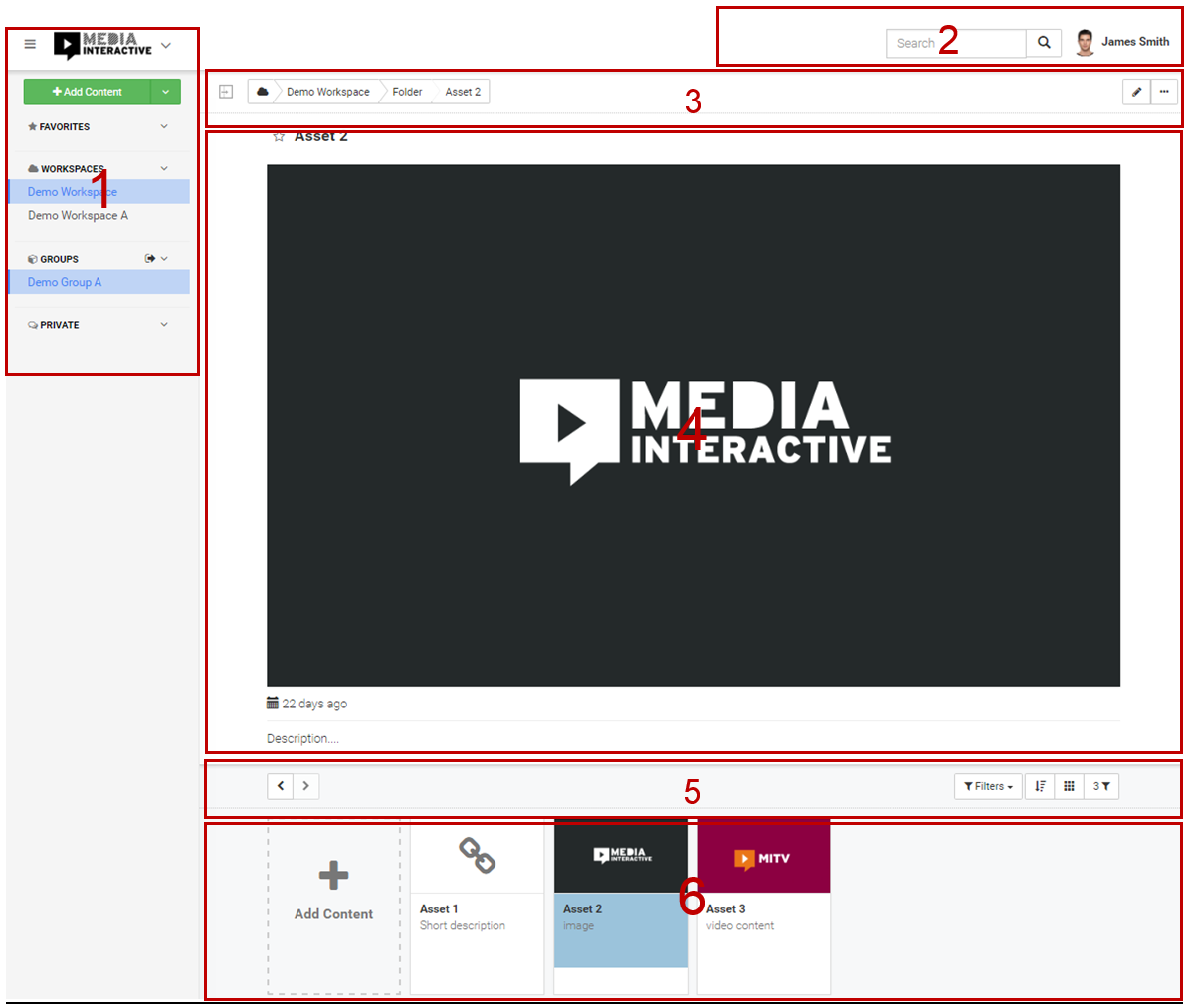
Image – platform user interface
-
The first part allows selecting workspace, group, favorite asset, private group and includes a button for adding new content or files. The user should be always present in one workspace. If the sticky menu is not visible, the user must press the button
 , which is located in the upper left corner of the interface. In an identical way, the user can also hide the menu.
-
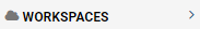
Workspace selection: the user should have already selected one workspace when entering one of the platform. Workspace selection effects of the list of assets. The user can select workspace in two ways. By clicking the arrow
 in the upper left corner on the right side of the logo. The arrow is displayed if the user has access to at least two. After clicking on the arrow, list of all accessible workspaces will be displayed. By clicking on the user selects the desired workspace. Currently selected workspace is colored in blue.
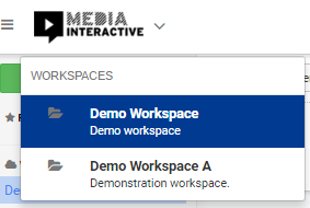
Image – list of all workspaces
The user can also select the desired workspace via the sticky menu on the left side of the interface. Workspaces are listed under the heading WORKSPACES. Currently selected workspaces is colored in blue. This list of workspaces can also be hidden. By pressing the arrow
 to the right of WORSPACES text, the list will be displayed.
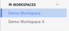
Image – the list of workspaces in sticky menu
At the same time can be selected bout workspace and group, but can be at the same time active only one. Active means that the currently displayed content and list of asset are part active workspace or group. In the event that the group is active, the user can activate the workspace so that clicks on the logo, which is located in the upper left corner. Logo always represents the currently selected workspace.
-
Group selection: the user can select a group in the sticky menu at the left side of the interface. Groups are listed under the heading GROUPS. The currently selected group is colored blue. This list of groups can also be hidden. By pressing the arrow
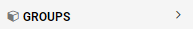 to the right of GROUPS text, the list will be displayed.
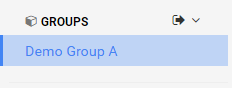
Image – the list of groups in sticky menu
In contrast to the workspace, the user may not have selected any group or he can unselect it. User can unselect the group by clicking on button
 , which is located to the right of GROUPS text.
 -
Favorite asset selection: Each asset can be marked as favorite. The user can marked asset by clicking on yellow start, which is located next to asset title. Asset title will appear in the sticky menu on the left side of the interface under the title FAVOURITES. By clicking on title user can select favorite asset. After click, the asset will appear and an appropriate workspace will be selected. This list of favorites can also be hidden. By pressing the arrow
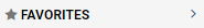 to the right of FAVOURITES text, the list will be displayed.
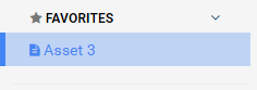
Image – the list of favorites in sticky menu
-
Private group or chat selection: the user can select a private group in an identical manner as he selects the group.
More about functionality, usage, editing, creating workspaces, groups of private groups is available in the user guide Collaboration Documentation.
-
-
The second part contains text search field and display the currently login user.
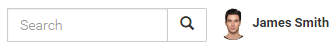
Image – the part with text search field and the currently login user
The text search is described in detail in the next chapter Search assets. In the far right corner the currently login user picture with name is displayed. The user can edit some personal settings by clicking on his picture or name. After click, the edit user interface appears. The user can change his name, display picture, change the interface language, manages the settings for receiving notifications, can retrieve password or logout from the platform. More in chapter Edit user account.
-
The third part is intended for navigating through assets (left part) and edit the currently displayed asset (right part).

Image – the part for navigating through assets and edit the currently displayed asset
The left part of the interface show breadcrumb or the position of the currently displayed asset on the platform. The picture above shows the currently active asset named Asset 2, which is located inside the folder Folder, which is located within the workspace Demo Workspace. By clicking on individual breadcrumb user can move to the desired folder or he move on first asset of the workspace.
The right part of the interface contains one or two buttons to edit the currently displayed asset. The first button with a pencil is available to the user which has the right to edit the asset (right Asssets/Update or he is the owner of the asset). After click on the button
, the edit asset interface will displayed (more in chapter Edit asset).The second button with three dots is visible to all users only options within it are restricted to certain rights. When clicking on the button with tree dots more options is displayed.
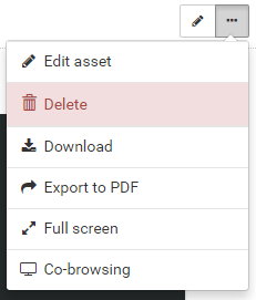
Image – the button with three dots
-
Edit asset: the option to display the edit asset interface. The option is available to the user who has the right to edit the asset (right Assets/Update or he is the owner of the asset).
-
Delete: the option to delete the currently displayed asset. The option is available to the user who has the right to delete asset (right Assets/Delete or he is the owner of the asset).
-
Download: the option that allow user to download ability to download a file that was uploaded to the currently displayed asset. This option is available if on the currently display asset has been uploaded file on the content of specific file and the field Disable Download (false) / Download Custom file (path) has not been set to false.
-
Export to PDF: the option that display the currently displayed asset in PDF format. After selection it, a new window with the PDF will display.
-
Full screen: the option to display currently displayed asset in full-screen mode.
-
Co-browsing: the option that allow user to display the currently displayed asset in co-browsing window. It is a way to display content in a new window, which is the right aspect ratio that fit in the conference (for more information view the user guide Collaboration Documentation).
-
Digital signature preview: the option to display asset in playback mode. Visible only to the administrator.
-
-
The fourth part represents the area where asset content with title is displayed (video, image, text...) and some other optional fields such as contextual line, the date of asset creation, number of views, duration, cuepoints.
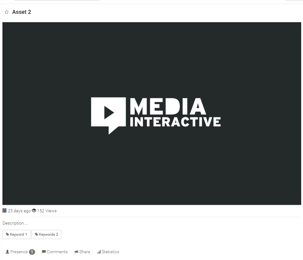
Image – asset content with title and some other fields
At the top of the area is located asset title. Underneath is the asset content. Showing varies, depending on the content type (VIDEO, AUDIO, PDF, URL ...).
Below or on the right side can be displayed various information regarding the asset:
-
The date of asset creation. Information represent field Date. If the field is empty, the information is not displayed.

Image – information about date
-
Media file duration. Information represent field Duration. If the field is empty, the information is not displayed.

Image – information about duration
-
The number of views. The number of views is visible only to the user who has the right Other/Statistics.

Image – information about the number of views
-
Keywords. Words or phrases that represent the asset. Specified the field Keywords.
Image – keywords
In the case that are on the video asset also defined cuepoints, they also be (more in chapter Adding cuepoint to media asset).
At the bottom of the area, the contextual row can also be displayed. This row is displayed if the asset has selected option Context. More in chapter Contextual row.
-
-
The fifth part is intended to move through the history of the movement on the platform (left part), selection of the display mode, sorting list of assets and filtering or searching (right part).

Image – the part with buttons to move through the history, selecting the display mode, sorting list of assets and filtering or searching
On the left side, two buttons are located - left and right arrow. The arrows let the user to move through the history of previously viewed assets. If the user presses the left arrow button, the previously selected asset is served. With the left arrow button, the user can moves through the history of the past, with right arrow button in the present.
On the right side, there are several buttons:
-
The first button is intended to select the global or personal filters, which have been created in advance. When user click on the button, a list of global filters (if present), personal filters (if present) and the option All assets to display all assets to which the user has access. If any of filter is active, the button will show filter name or Custom filter if advanced search is enabled. More about managing and creating filters in section Find asset.
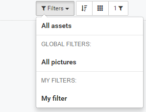
Image – dropdown menu of saved filters
-
The second button
 is intended for sort and order display of assets in the list of assets. Sort and order options are described in chapter Sort assets.
 -
The third button
 is intended for changing the entire asset view. Possible types of preview are explained in detail in the next chapter Types of assets view in the list of assets.
 -
The fourth button
 shows the number of displayed asset in the list of assets. In the case of searching, it shows the number of results. If the user click on the button, advanced search interface will appear. More about advanced search in chapter Find asset.
-
-
The sixth part represents the area where the list of assets is displayed. The list depends on the currently displayed asset. It the currently displayed asset is folder then list represents assets in this folder or if it isn’t folder list represents assets that are in the same folder as currently displayed asset. In the case, that user trigger text or advanced search, the list represents the search results. Currently displayed asset is colored in blue. The list of asset can be displayed in the different views (more in chapter Types of assets view in the list of assets).
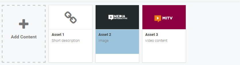
Image – the list of assets
Sort assets
By default, assets in the list of assets are listed in Ascending order and are sorted by Seekstamp, or in the case of an equal values by Title and in the case of re-equating by creation date (Created at). The current sort and order are visible under button (image below).
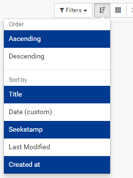
Image – current sort and order
The dropdown is organized in two parts:
-
The first part represents the order in which assets will be listed. It is possible to select Ascending or Descending order.
-
The second part represents the sort of assets. There are several options:
-
Sorted by Title – which means that the assets are sorted according to the alphabetical of the title. In case of choosing the Ascending order asset will be ordered from A to Z.
-
Sort by Date - which means that the assets are sorted according to the filed date, which is manually configured on the asset (Date field under Display tab in the edit asset interface – more in chapter Explanation of individual fields on the asset). In case of choosing the Ascending order asset will be ordered from oldest to most recent date.
-
Sort by Seekstamp - which means that the assets are sorted according to the filed seekstamp, which is manually configured on the asset (Seekstamp field under Display tab in the edit asset interface – more in chapter Explanation of individual fields on the asset). In case of choosing the Ascending order asset will be ordered from lowest to highest (number).
-
Sort by Last Modified - which means that the assets are sorted according to the date when the asset was last modified. In case of choosing the Ascending order asset will be ordered from older edited to last edited asset.
-
Sort by Created at - which means that the assets are sorted according to the date when the asset was created. In case of choosing the Ascending order asset will be ordered from oldest to newest content.
-
Types of assets view in the list of assets
The platform provides three different views of assets in the list of assets. The user can switch between different views by clicking on the button . After pressing the button, the list of view options will appear. Currently displayed view is colored.
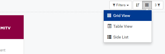
Image – The button for switching between different views
Let's look at the individual views:
-
Grid View

The grid view is the default view. The asset is displayed in the upper part of the user interface, below the list for assets (assets in square form) is displayed.
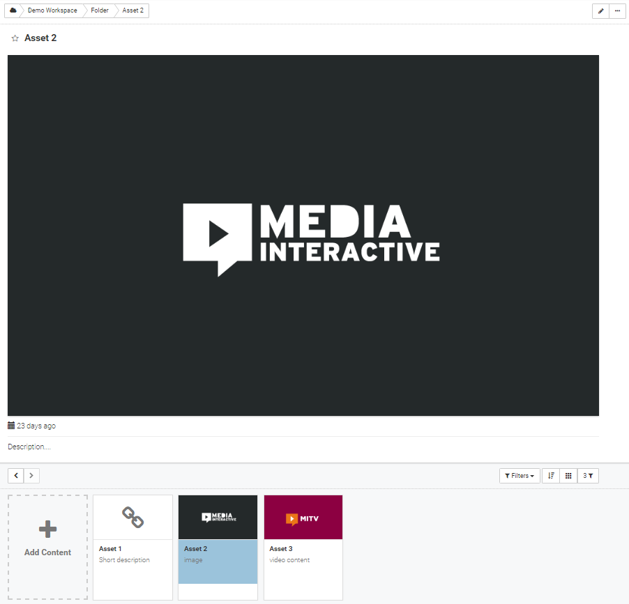
Image – Grid View
In the list of assets, square with thumbnail, title and short description represents the asset. At the bottom of the square, when the mouse is moved over, in the right hand corner, the button with three dots and the duration of the media file (if defined) appears.
Image – asset display in the grid view
-
Table View

The table view is similar to the grid view with the difference that the assets in a different way (in tabular form) rea displayed. Table view shows certain additional fields on the asset and allow user to select multiple asset and then over them, preform some operations (moving, editing). Which fields will be displayed can be determined only by a system administrator.
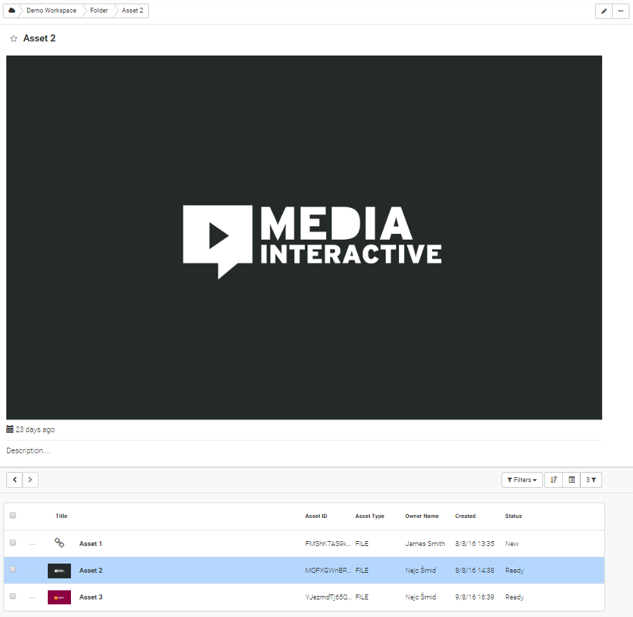
Image – Table View
In the list of assets, a log row with check box (multiple select), thumbnail, title and six adjustable fields represents the asset. On the right side of the row, when the mouse is moved over, the button with three dots appears.

Image – asset display in the table view
-
Side List

The side list view is slightly different from the grid or table view. In side list view the list of asset is displayed on the on the left side of the asset display. On the right side of the row, when the mouse is moved over, the button with three dots appears.
Image – side list view
In the list of assets, a short row with check box (multiple select), thumbnail, title and short description represents the asset.
Image – asset display in the side list view
Contextual row
Contextual row represents a set of additional information and functionality on the asset. The row consists of several tabs that are visible to the user depending on his rights. The row is located just below the asset content.
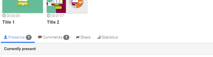
Image – contextual row
Contextual row represent the following tabs:
-
Share – tab represents the ability to share asset on social networks or via embed code. The tab is available to any user, regardless of his rights.
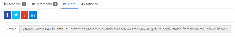
Image – share tab
-
Presence – tab presents a list of users that are currently watching displayed asset. The tab is visible to the user which has the appropriate right (right Collaboration/Presence).
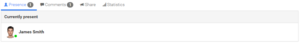
Image – presence tab
-
Comments – tab represents the interface to add comments on the asset. Under the tab is located field to post a comment, and a list of all existing comments on the asset. Comment is composed of image, name of the person who created the comment, the time of comment creation, the comment and two evaluation buttons. Users can vote for a particular comment by selecting one of the evaluation button. The owner or administrator may delete comment. The tab is visible to users if the asset has selected option Enable comments.
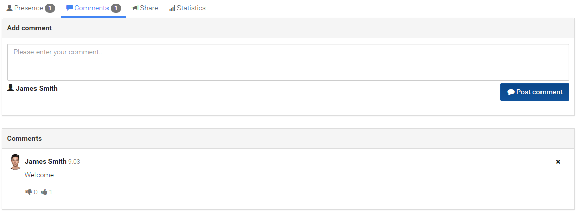
Image – statistics tab
-
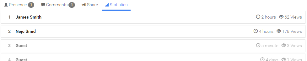
Statistics – tab represents statistics on asset. Statistics showing the user name, time of last visit and the number of views. Users are arranged from user who has the most views to user with least views. The tab is visible to the user which has the appropriate right (right Other/Statistics).
Slika – zavihek statistika
Find asset
The platform provides several ways to search asset or create different filters that control a set of assets that are listed on the list of assets. In general, there are three ways to search:
-
text search,
-
search by keyword,
-
advanced search.
Text search
The user can search by part of word, word, phrase, which is part of the asset title, short description or description. In the case, that PDF file was uploaded (made indexation) the user can also search by words that are in the text of a PDF file.
The user can perform text search by typing part of a word, a word or phrase in the field, which is located in the upper right corner of the platform and c lick on the button  .
.
Image – filed for text search
The results will display in the list for assets. Above them in the right corner the button with number of hits will also displayed.
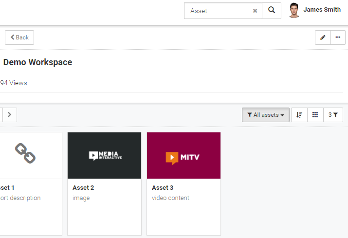
Image – text search results
The user can cancel search by clicking on the button  within text search field. After click will user in the list of assets see assets, which are located under current asset (if it is folder), or in the same folder as current asset.
Search by keyword
The user can equip asset with different keywords. In the edit asset interface under filed Keywords user can enter several words or phrases that represent the asset. Keywords are visible under or right next to asset content. User can search by keywords by clicking on one of them.
In the part of interface that is located above the list of assets shall be visible active keywords 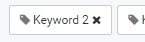 . User can remove specific keyword from a search by pressing it.
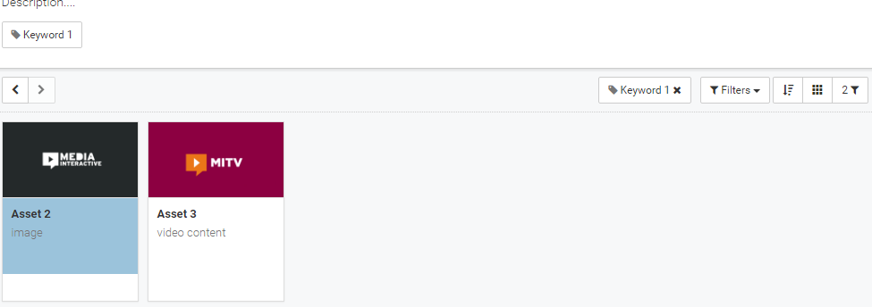
Image – search by keywords
Search results will display in the list of assets. Above them in the right corner the button with number of hits will be displayed.
The user can cancel search by clicking on every keyword . After click will user in the list of assets see assets, which are located under current asset (if it is folder), or in the same folder as current asset.
Advanced search
The platform also provides the user interface for advanced search. The user can access the interface for advanced search by clicking on the button , which is located on the right side of the list of assets. When user press the button, the interface for creating advanced filters or advanced search will appear. The interface always shows the status of the preset filters. Typically, this permission group of active workspace or group and the ID of the parent asset (Parent ID).
The user can add or delete fields after which he wants to search, or from which he will create an advanced filter. The interface for advanced search is composed of three logical parts:
-
search group,
-
search filed,
-
the value and operator of the search filed.
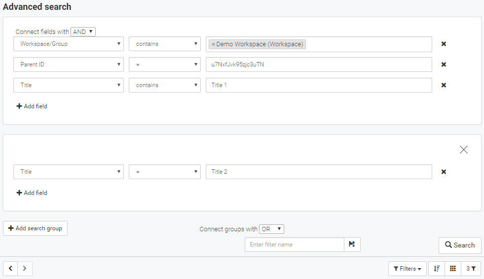
Image – the interface for advanced search
Search group
The search group is the largest unit in the search filter. Within the search group can be specify many fields. Search groups are linked with one of two operators: AND (all search groups conditions are met) or OR (at least one of search groups conditions is met). User can set this operator in dropdown menu, which is located under the rear search group. The inscription Connect groups with.
User can add an unlimited number of search groups by clicking on the button 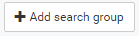 . User can also remove specific search group by clicking on the button
  , which is located in the upper right corner of the group.
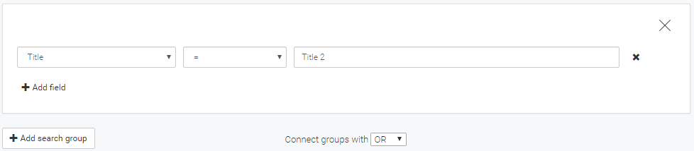
Image – search group
Search field
Within the search group user can add specific field and on ti binds the desired condition. Individual fields are also linked with one of two operators: AND (all fields conditions are met) or OR (at least one of fields conditions is met). User can set this operator in dropdown menu, which is located on the left side of the first field. The inscription Connect fields with.
User can add an unlimited number of search fields by clicking on the button  . User can also remove specific search field by clicking on the button , which is located in the right side of the field.

Image – search field
The value and operator of the search filed
The search field is divided into three parts.
The first part, which is located on the left side of the field, represents a dropdown for selecting the desired asset field after which the user wants to search. A system administrator may modify a set of available asset field.
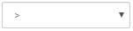
The second part, which is located in the middle of the field, represents a dropdown for selecting the operator. A set of operators is different depending on the type of the selected field. Following operators may be displayed:
-
 equal to. The value on the right side must be identical to the value written to the asset field selected on the left side.
 -
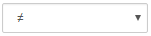 not equal to. The value on the right side is not equal to the value written to the asset field selected on the left side.
 -
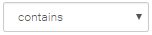 contains. The text on the right side can be a part of the text or element in the set written to the asset field selected on the left side.
 -
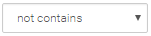 not contains. Element selected on the right side is not a part of set written to the asset field selected on the left side.
 -
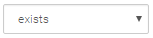 exists. The asset field selected on the left side is defined in the asset.
 -
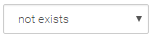 not exists. The asset field selected on the left side is not defined in the asset.
 -
 less than. Available in numbers or dates. The value written to the asset field selected on the left side is less than the value on the right side.
 -
 greater than. Available in numbers or dates. The value written to the asset field selected on the left side is greater than the value on the right side.
 -
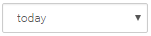 today. Available in dates. The date written to the asset field selected on the left side is today's date.
 -
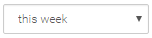 this week. Available in dates. The date written to the asset field selected on the left side is inside this week.
 -
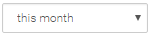 this month. Available in dates. The date written to the asset field selected on the left side is inside this month.
 -
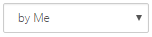 by me. Available in the fields containing user ID. On the asset field selected on the left side is written ID currently login user.
 -
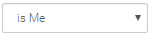 is me. Available in the fields containing user mane. On the asset field selected on the left side is written name of currently login user.
 -
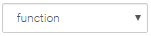 function. On the asset field selected on the left side is written value equal to the result of the function on the right side.
The third part represents the value, which is taken into consideration for the condition. There are several selection types. Value can be text, number, date or set of values.
Once the user is satisfied with the selection of search fields and groups, he can trigger search. This is done by clicking on the button Search in the bottom right corner.
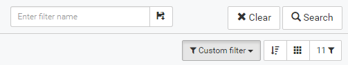
Image – advanced search
Search results will display in the list of assets. Above them in the right corner, the button with number of hits  will be displayed. In the save filter dropdown menu the inscription
 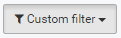 will also appear.
The user can cancel the advanced search by clicking the button  that appears when the advanced search is active. After click will user in the list of assets see assets, which are located under current asset (if it is folder), or in the same folder as current asset.
In the event that textual search is also active, it also appears in the interface for advanced search. In this interface, the user can only cancel text search.
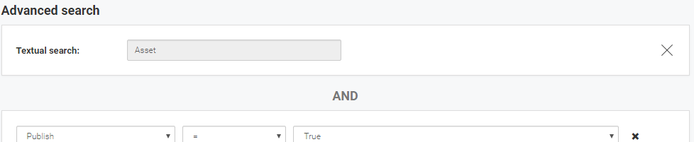
Image – text search inside the interface for advanced search
The user can combine text search, keyword search and advanced search. Text search is with other advanced search groups linked with AND operator.
Display all assets
The user can display a list of all assets to which he has access. This can be done in two ways.
-
By selecting option All assets all content which is located in the dropdown menu Filters.
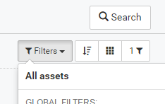
Image – option All assets in the dropdown menu Filters
-
In the advanced search, user should delete all search fields and click on the Search button. Inside the Interface for advanced search inscription All assets is displayed.
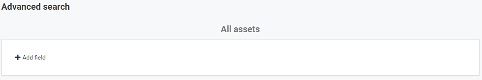
Image – the interface for advanced search
Save filter
The user can also save the advanced search (filter). Only registered users can save filter. The user can save created filter by typing the filter name in the filed next to the Search button and then click on the button  . All search filed and groups, text search and order will be saved.
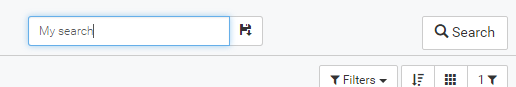
Image – save filter field
The user creates a personal filter that is available in the dropdown menu Filters. Dropdown menu contains option All assets, list of all GLOBAL FILTERS and list of all personal filters MY FILTERS. When user click on saved filet, filter will triggered. On dropdown the name of the currently active saved filter will appear.
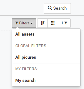
Image – the dropdown menu Filters
Global filters
Personal filters can also become global filters. The user can through the advanced search fid his filters. This is done by selecting Asset Type search field and selects the option FILTER and then pressing Search.
The user shout then select on preferred filter option Publish. Global filter will only be visible to the workplace or the group in which it was made. Personal filter then becomes global and is accessible to all users who have the right to access the selected workspace or group.
Asset type
The platform supports many different types of asset. Let’s look at each type.
Text
The asset can also be just textual. For this type of asset, the user set the parameter asset type on FILE, content type on the URL, the URL field should be empty and in the Description field, he should enter the desired text, which can be individually designed.
Needed settings for functioning of the textual asset:
-
In Description field entered the desired text.
-
Asset Type: FILE.
-
Content Type: URL.
-
Open in: optionally.
Video
This type of asset is intended to display video files. The user should upload video file through module Add new media/file in the edit asset interface (supported types: mp4, mov, wmv, mpg, webm, m4v, 3gp, flv, mkv, ogv). After file upload is complete, automatic detection of file type is carried out - the thumbnail, poster, video for quick preview is created and some other parameters are set (see chapter Automatic detection of file type). Video file is also automatically transcode. Transcoding is intended to convert video files (high quality) in several video files of various qualities (lower quality) (see chapter Transcoding).
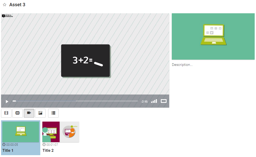
Image – video content
Uploaded video content is displayed to users in a way that it shows the above image. In the upper right corner, the title of the asset is displayed. Underneath a video player is displayed. Below it, four buttons are available, which allow the user to change position of the player and description, which is located on the right side of the interface. Above the description, the duration of the video and curation date (if the field Duration and Date is specified) is displayed.
In the case that the video asset has cuepoints (more in chapter Adding cuepoint to media asset), they will be displayed below the video player.
Needed settings for functioning of the video asset (settings should be set in the automatic detection of the uploaded file):
-
Uploaded video file in the appropriate format.
-
Asset Type: FILE.
-
Content Type: VIDEO.
-
Open in: optionally.
-
Entered appropriate encodings depending on transcoded files.
Audio
This type of asset is intended to display audio files. The user should upload audio file through module Add new media/file in the edit asset interface (supported types: mp4, wav, wma, flac, m4a, ogg, aac, mid, aiff, ape). After file upload is complete, automatic detection of file type is carried out - the thumbnail (if the audio contains an image), poster (if the audio contains an image), player for quick preview is created and some other parameters are set (see chapter Automatic detection of file type). Audio file is also convertet in aac format and audio track is ctrated. Audio file is available in one quality.
Image - audio content
Uploaded audio content is displayed to users in a way that it shows the above image. In the upper right corner, the title of the asset is displayed. Underneath audio player with audio track is displayed. Below it, description and above the description, the duration of the audio and curation date (if the field Duration and Date is specified) is displayed.
Needed settings for functioning of the audio asset (settings should be set in the automatic detection of the uploaded file):
-
Uploaded audio file in the appropriate format.
-
Asset Type: FILE.
-
Content Type: AUDIO.
-
Open in: optionally.
-
Entered 6 quality encoding depending on transcoded audio file.
HTML/ZIP
This type of asset is intended to display HTML content. The user should upload zip file with HTML through module Add new media/file in the edit asset interface. After file upload is complete, automatic detection of file type is carried out – the thumbnail (fa-archive) is created, archive is expanded into a folder named after asset ID and in the URL field is set the path to archive file (see chapter Automatic detection of file type).
Image - HTML content
Uploaded HTML content is displayed to users in a way that it shows the above image. In the upper right corner, the title of the asset is displayed. Underneath HTML content is displayed. Below it, description and above the description, the curation date (if the field Date is specified) is displayed.
Needed settings for functioning of the HTML asset (settings should be set in the automatic detection of the uploaded file):
-
Uploaded zip file.
-
Asset Type: FILE.
-
Content Type: URL.
-
Open in: optionally.
-
In the URL field should be set the path to archive file (for example: /content/ + ID + /index.html). By default, the path to the file index.html is set.
Image
This type of asset is intended to display image files. The user should upload image through module Add new media/file in the edit asset interface (supported types: png, jpg, gif). After file upload is complete, automatic detection of file type is carried out - the thumbnail, poster and in the URL field is set the path to uploaded image (see chapter Automatic detection of file type).
Image - Image content
Uploaded image is displayed to users in a way that it shows the above image. In the upper right corner, the title of the asset is displayed. Underneath image is displayed. Below it, description and above the description, the curation date (if the field Date is specified) is displayed.
Needed settings for functioning of the image asset (settings should be set in the automatic detection of the uploaded file):
-
Uploaded image in the appropriate format.
-
Asset Type: FILE.
-
Content Type: URL.
-
Open in: optionally.
-
In the URL field should be set the path to image file (for example: /content/gqJkZ3H3yNTs4FMaK.png).
This type of asset is intended to display PDF files. The user should upload pdf file through module Add new media/file in the edit asset interface. After file upload is complete, automatic detection of file type is carried out - the thumbnail (first page), poster (first page) and in the URL field is set the path to uploaded pdf (see chapter Automatic detection of file type).
Image – PDF content
Uploaded PDF is displayed to users in a way that it shows the above image. In the upper right corner, the title of the asset is displayed. Underneath PDF is displayed. Below it, description and above the description, the curation date (if the field Date is specified) is displayed.
Needed settings for functioning of the PDF asset (settings should be set in the automatic detection of the uploaded file):
-
Uploaded pdf file.
-
Asset Type: FILE./p>
-
Content Type: URL.
-
Open in: optionally.
-
In the URL field should be set the path to pdf file (for example: /pdf/viewer.html?file=/content/kKc6Mv7XEkZNwZZXk.pdf).
Slides (PPT)
This type of asset is intended to display slides. The user should upload ppt or pptx file through module Add new media/file in the edit asset interface. After file upload is complete, automatic detection of file type is carried out – the file is converted to PDF format and each slide is converted in the image asset, which is located under PDF asset (see chapter Automatic detection of file type).
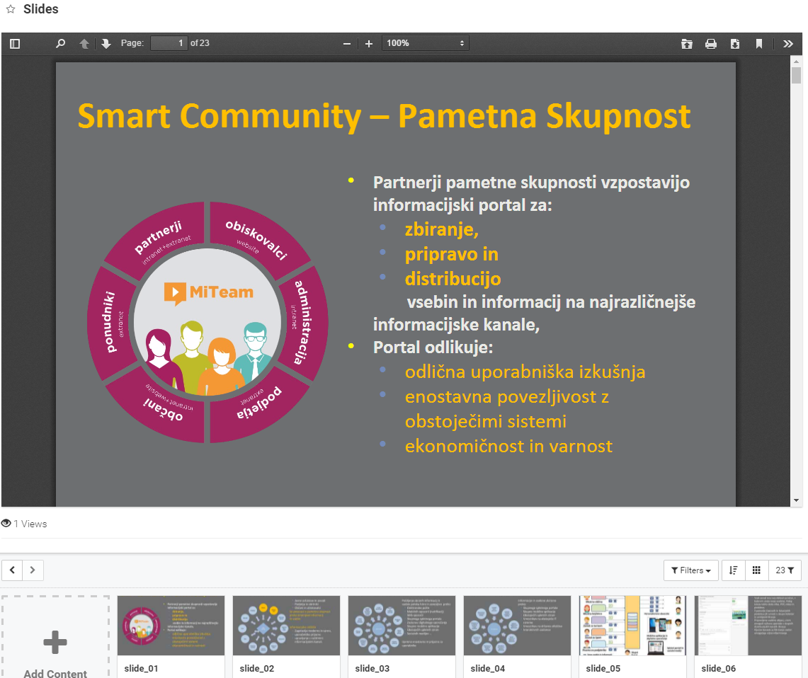
Image – slides
The user can review slides in PDF format or he can mode from slide to slide in a way that he select particular slide asset. Settings needed for functioning PDF and Image content is described in the previous chapters.
Playlist
Asset can also represent a playlist, which is set of contents sequentially playback in full-screen mode. The user can any of the assets convert in the playlist. For this type of asset, the user should set the parameter asset type on FILE, content type on the PLAYLIST and Open in on the PLAYER.
The interface for editing the playlist appears. After click on the button Preview, the playlist in full-screen preview will appeared. More about the playlist in chapter Playlist.

Image – playlist
Download
Download type is intended to download the uploaded file. For this type of asset, the user should set the parameter asset type on FILE and content type on the DOWNLOAD. On the asset next to the title and description, a big button to download the file is displayed. This settings are also set after file upload is complete and automatic detection of file type is carried out (see chapter Automatic detection of file type).
Image – download asset
Needed settings for functioning of the download asset:
-
Uploaded file.
-
Asset Type: FILE.
-
Content Type: DOWNLOAD.
-
Open in: optionally.
Filter
Filter type represents asset that contains saved advanced search or filter (filed Filter form, Search form and Sort form). If user click on this type of asset saved filter will be triggered (this applies to any asset that has set field Filter form). Such asset is generated when the user saves the advanced search or filter (see chapter Save filter).
Needed settings for functioning of the filter asset:
-
Asset Type: FILE.
-
Content Type: FILTER.
-
Open in: optionally.